Components
The Components feature in SquareLine Vision provides a powerful way to implement modular UI design by turning repetitive layouts into reusable templates. By converting complex widget structures into standalone components, you can maintain strict visual consistency across your entire application while drastically reducing development time. Any modifications made to a main component instantly cascade to every instance in your project, giving you centralized control over your interface elements while still retaining the flexibility to override properties locally on an instance-by-instance basis.
A component can be a single widget or a complex group of widgets representing an entire subtree in the hierarchy. Component templates are displayed in purple within the hierarchy panel and are tracked inside the Component Manager tab located directly next to the hierarchy panel. The Component Manager shows a preview thumbnail of every component, which is refreshed each time the component is saved.
Creating a component
To generate a new component template from an existing layout:
-
Select the target layer or widget subtree in the hierarchy panel that you want to convert into a component.
-
In the Inspector panel, click the Create a Component button.
-
The selected layer and all of its child layers will turn purple in the hierarchy, indicating that the element is now a component, and the component editor opens.
Editing a component
To modify the design, properties, or behavior of a component:
-
Select any instance of the component layer within the hierarchy panel.
-
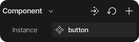
Navigate to the Inspector panel and look under the Component menu section.
-
Click the Go to main component button to enter the isolated Component Editor workspace.
A component can also be opened directly from the Component Manager: hover over the component, click its three dots (...) icon and select Edit. This is useful for components that have no instance on any screen, for example components that are only used inside other components.
The component editor workspace
When inside the component editor, the canvas focuses exclusively on the main component template design. You can use the following control tools within the Inspector panel to manage your workspace:
-
Go to main component: Navigates directly to the root element of the main component structure.
-
Reset to default: Rolls back any unsaved changes to the component's last saved state.
-
Instance: Allows you to rename the component template identifier.
Component sizing
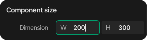
You can define the precise dimensions of the component wrapper or its individual internal elements:
-
Select the specific sub-element you want to resize from the hierarchy panel.
-
Adjust the width and height values within the size settings group.
Component states
Component states enable you to manage visual or behavior variations directly inside the template structure.
-
Configuration: States are tracked and managed through the dedicated States section in the Inspector panel while editing the component.
-
Application: This enables state-based property adjustments across the component's internal widget subtree.
Component properties
Component properties let you expose specific internal parameters, making them customizable on individual instances outside the component editor workspace.
-
Universal Creation: You can generate component properties for any inspector element parameter or style attribute.
-
Custom Labels: Component properties can be fully renamed to provide clean, contextual labels for clear configurations.
-
Value Assignment: Once exposed, these property values can be updated directly from the main workspace on a per-instance basis, overriding defaults safely without breaking the main component structure.
Saving or discarding changes
While the component editor is open, two buttons are displayed in the header of the Simulator panel:
-
Save Component: Commits your updates. Saving instantly pushes all structural modifications, states, and newly exposed properties to every instance across the project, and closes the editor.
-
Cancel: Leaves the editor without saving. If the component has unsaved modifications, a confirmation dialog appears; choosing Discard reverts the component to its last saved state, so the instances on the screens are not affected. When the editor of a newly created component is cancelled, the component is removed and the original widgets are restored on the screen.
If there are no unsaved changes, Cancel simply closes the editor.
Component variants
A component can have several named variants, for example a default, a highlighted and a compact version of the same button. All variants share the structure of the component (widgets, states, events and exposed properties) and differ only in values: a variant stores only the properties that were changed compared to the primary variant, and every value that is not overridden keeps following the primary variant. The first variant of every component is the primary variant, named Variant 1 by default.
Managing variants
Variants are managed in the component editor:
-
Every variant has its own artboard on the canvas, side by side. The active variant is marked with its name in purple above the artboard and with its size below it; clicking an artboard makes that variant active.
-
Add variant: Click the + Add variant button next to the last artboard, or the plus (+) icon of the Variant row in the Component section of the Inspector. The new variant starts as a copy of the active variant and is named automatically (Variant 2, Variant 3, ...).
-
Rename: The root of the hierarchy shows the name of the active variant; double-click it to rename the variant. The name of the component itself is edited in the Component section of the Inspector.
-
Delete: Open the Variant dropdown in the Inspector and click the minus (-) icon of a variant. The primary variant cannot be deleted. If instances use the deleted variant, the confirmation dialog shows their number, and they switch to the primary variant.
Editing a variant
Select a variant and edit its widgets as usual in the Inspector and in the Styles panel. Values that differ from the primary variant are highlighted in purple in the Inspector.
-
Structural changes are shared: adding, deleting or moving widgets, and adding states or events affect every variant. Style parameter rows and blocks can only be added or removed while the primary variant is active.
-
A widget added while another variant is active is created hidden in the primary variant and in the other variants, and visible only in the active variant. Widgets hidden in the active variant appear greyed out in the hierarchy.
-
Deleting a widget removes it from every variant of the component; a confirmation dialog warns about this when the component has more than one variant.
Using variants on instances
When a component has more than one variant, a Variant dropdown appears in the Component section of the Inspector for every instance. Switching the variant keeps the local property overrides of the instance: the precedence is instance override, then variant, then primary variant. The variant of an instance can also be changed at runtime with the Change variant event action.
Nested components
A component can contain instances of other components. This makes it possible to build complex, reusable structures, for example a list item component that contains a button component.
Adding a component inside another component
-
Open the parent component in the component editor.
-
Drag a component from the Component Manager onto the canvas of the editor.
-
The nested instance appears in the structure of the parent in purple, as a single element in the hierarchy.
-
Save the parent component.
A component cannot be nested into itself, and circular references (component A contains B, while B contains A) are not allowed; such drops are rejected with a warning.
Inherited properties
The exposed component properties of a nested component automatically appear in the Component properties block of the parent component, grouped under the name of the nested instance. Deeper nesting levels are shown indented under each other.
-
Inside the component editor, an inherited property can be overridden for the parent component; this value becomes the default for every instance of the parent.
-
On a screen instance of the parent, the same inherited properties can be overridden per instance.
-
Inherited properties offer Reset to default, but they cannot be renamed or deleted from the parent. Rename or remove them in the component they belong to.
-
Editing the nested component later updates every component and instance that contains it.
Editing a nested component
While a component is being edited, the editor of a nested component cannot be opened from within it. Finish editing (Save Component or Cancel) first, then open the nested component with the Go to main component button of one of its instances, or with the Edit option in the Component Manager.
Detaching an instance
An instance can be converted back to regular widgets:
-
Select the instance in the hierarchy.
-
In the Inspector panel, click the three dots (...) icon in the Component section.
-
Select Detach instances and confirm with Detach.
The instance becomes a regular widget tree: the component container becomes a Container, and nested components are flattened as well. The widgets keep their current appearance, including the local overrides, but lose their link to the component definition, so later changes of the component no longer affect them. Detaching cannot be undone. The same menu also offers Reset to default, which discards the local overrides of the instance.
Removing a component
To completely delete a component template from your project, follow these sequential steps:
-
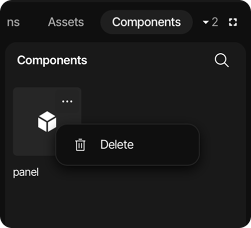
Manually delete all existing instances of the component from the project hierarchy panel. While instances exist, the deletion is blocked and a Component in use dialog lists the remaining instances, including the ones nested in other components (shown as
instance (in host component)). -
Click on the Component Management tab located directly next to the hierarchy panel header.
-
Select the target component template from the list manager.
-
Click the three-dot icon in the upper-right corner of the manager panel.
-
Choose the Delete option from the dropdown menu to permanently remove the component.