Assets
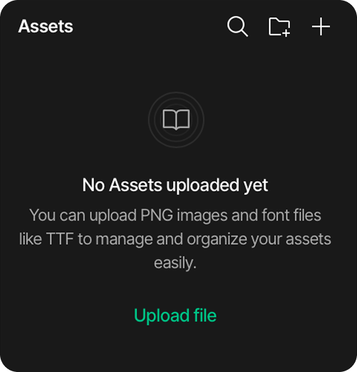
The Assets panel in SquareLine Vision is the central repository for all external resources used in the project, including fonts and images. The Assets panel is located in the left sidebar of the interface.
File type restrictions
SquareLine Vision only supports the following file types for assets:
- PNG files for images
- TTF files for fonts
- SVG files for vector graphics
Main area
The main area displays all assets added to the project. The default assets include:
- Montserrat-Regular font
- Montserrat-Bold font
These fonts provide a starting point for designs without requiring additional font installations.
Searching assets
- Click the magnifying glass icon in the top-right corner
- Enter keywords to filter through the assets
- The panel will display only matching results
Adding a new asset folder
- Click the file icon in the top-right corner
- Name the folder
- The new folder will appear in the assets panel
Adding assets
There are two methods to add assets to a project:
Method 1: Using the add button
- Click the plus (+) button in the top-right corner of the Assets panel, or click on the "Upload file" button
- Navigate to the file location on the local computer
- Select the file and click "Open"
- The asset will appear in the Assets panel
Method 2: Drag and drop
- Locate the files to be added on the local computer.
- Select one or multiple files
- Drag the selected files directly into the Assets panel
- Release to add all selected files simultaneously
Managing assets
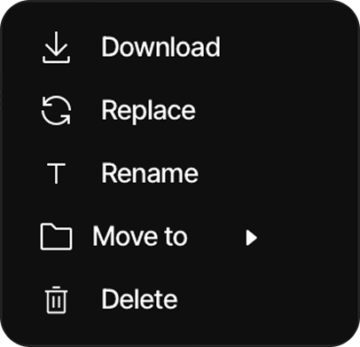
Clicking the three dots at the top of an asset opens the asset management tab.
There are five options inside:
-
Download: Downloads the selected asset.
-
Replace: Replaces the selected asset. If an asset is dragged and dropped with the same file name as an existing asset, a prompt will appear asking whether to replace it or save it under a different name.
-
Rename: Renames the selected asset.
-
Move to: Moves the selected asset to the desired folder inside the asset manager.
-
Delete: Deletes the selected asset.
Viewing asset references
Clicking an asset in the Assets panel opens a reference window showing exactly where that resource is used across your project.
-
Asset Name: Displays the selected file being tracked (e.g.,
battery_bg.png). -
Locations: Lists the specific screens, components, and widget properties utilizing the asset (e.g.,
mainscreen underMask – Image source).
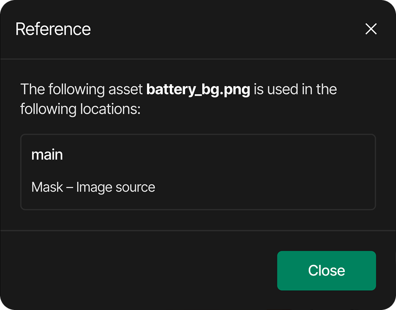
This overview allows you to verify dependencies before renaming, replacing, or deleting your files.
Asset usage information
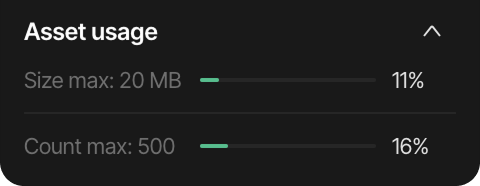
At the bottom of the Assets panel, there is a collapsible "Asset usage" section that displays resource utilization:
- Size max: "Number" MB: The maximum total file size allowed for all assets
- The progress bar and percentage show how much of this allowance you're currently using
- Count max: "Number": The maximum number of individual assets allowed
- The percentage indicates how many of your available asset slots are being used
can see where is the asset used in the project.
do it in the style of the documentation.
Asset Usage Reference
The Asset Usage Reference feature allows you to quickly identify exactly where specific assets (images or fonts) are currently implemented within your project. This tool is essential for managing resources, ensuring assets are correctly applied, and understanding the impact of potential modifications or deletions.
Accessing usage information
To view where an asset is being utilized:
-
Locate the desired asset within the Assets panel.
-
Click on the asset to view its properties or management options.
-
If the asset is currently in use, the system will provide a reference overview.
Understanding the reference display
When accessed, a Reference dialog will appear, providing a clear breakdown of the asset's integration:
-
Asset Name: Displays the name of the specific file being referenced (e.g.,
battery_bg.png). -
Usage Locations: Lists the specific screens, components, or widget properties where the asset is currently active.
- For example, it may indicate a specific screen name and the function or property the asset serves, such as "Mask – Image source".
This overview ensures that you can trace dependencies before making changes, helping to prevent unintended visual breaks in your UI design.
Would you like to know more about managing your project's assets or how to replace existing resources?
do it much shorter
Viewing asset references
Clicking an asset in the Assets panel opens a reference window showing exactly where that resource is used across your project.
MD
-
Asset Name: Displays the selected file being tracked (e.g.,
battery_bg.png). -
Locations: Lists the specific screens, components, and widget properties utilizing the asset (e.g.,
mainscreen underMask – Image source).
This overview allows you to verify dependencies before renaming, replacing, or deleting your files.
MD
for the animation section I need a description: can animate opacity and x and y position. Also add an interpolation description as there is interpolations as you can see in the screenshot that I have attached
Animated properties
You can animate multiple elements simultaneously by adding keyframes to the timeline. The primary animatable properties include:
-
X position: Controls the horizontal movement of the widget across the canvas.
-
Y position: Controls the vertical movement of the widget across the canvas.
-
Opacity: Adjusts the transparency level of the widget seamlessly throughout the transition.
Interpolations
Interpolation types define how a property transitions between two keyframes, allowing you to control the pacing and feel of the animation:
-
Linear: Changes the value at a constant, steady rate.
-
Step: Instantly snaps to the next value at the frame marker without any transition gradient.
-
Ease in: Starts the transition slowly and accelerates toward the next keyframe.
-
Ease out: Starts the transition quickly and decelerates as it approaches the next keyframe.
-
Ease in out: Begins slowly, accelerates in the middle, and slows down again at the end.
-
Overshoot: Slightly exceeds the target value before bouncing back to settle into its final position.
please rewrite the global colors to be global variables, this should include the following global variables:
colors: as was in the original .md file
images: global images
string: global text variables
number: global number variables
boolean: switches for global variables (this could switch properties like flags, states etc.)
array: A group of items that can be used in widgets with multiple options. (like spinbox, roller, dropdown)
Global Variables
Global variables allow users to manage a project's parameters and themes efficiently. By defining properties as variables, they can be updated in one central place, applying the changes automatically across the entire user interface. This guide explains how to create and manage global variables using the Variable Manager.
Managing Variables and Themes
Accessing the Variable Manager
The Variable Manager is located in the Inspector panel. Upon opening it for the first time, the list will be empty until your first global variable is defined.
Creating a Variable
-
In the Variable Manager, click the Create variable button.
-
Choose your desired variable type from the dropdown menu.
-
Give the variable an identifiable name (e.g.,
Primary_Color,Main_Title, orIs_Enabled). -
Assign its initial value based on the chosen variable type.
Adding a New Theme
Multiple themes can be created for a project to support look-and-feel variations (like Light and Dark modes):
-
Click the Add new theme button.
-
A new theme is created, and the system automatically copies all existing variables from the previous theme.
-
Theme-specific values can now be assigned to these variables to dynamically alter the interface when the theme switches.
Supported Variable Types
When creating a new variable, you can choose from the following types:
🎨 Color
Manages the project's color scheme.
-
Can be set as a Solid or Gradient value.
-
Configured using the built-in Color Picker to adjust hue, saturation, brightness, and alpha transparency.
-
Can be assigned to any style setting containing a color parameter (e.g., Background Color).
🖼️ Image
Global image variables allow you to reference image assets centrally.
- Useful for switching graphics, logos, or icons globally across different project themes.
🔤 String
Global text variables designed for managing text content.
- Simplifies updating titles, system labels, or preparing UI text strings for future localization.
🔢 Number
Global numeric variables used to control exact values throughout the UI.
- Ideal for defining shared widget dimensions, constant padding offsets, or boundary limits.
🔘 Boolean
True/False switches applied to global logic parameters.
- Frequently used as toggle states to dynamically switch widget properties, flags, or active states.
📊 Array
A structured group of items stored together under a single variable.
- Designed to populate options within multi-selection widgets such as Spinboxes, Rollers, and Dropdowns.
Applying and Editing Colors
For Color variables, you can fine-tune values directly via the color picker settings:
-
Select a Hue: Drag the circular handle on the rainbow-colored hue slider.
-
Adjust Saturation & Brightness: Move the selector within the main color field.
-
Set Transparency: Use the bottom alpha slider (indicated by a checkerboard pattern).
-
Enter Precise Values: Type values directly into the HEX, Red, Green, Blue, and Alpha fields.
Switching Themes Dynamically
Once your themes and variables are configured, you can preview theme overrides in real-time within the editor.
ⓘ BONUS TIP Theme changes can be triggered interactively by user input. Add an Event to a widget (such as a button), and select the Switch Theme action from the actions list to change the entire UI appearance during runtime.
Summary
Global variables erase the need to manually find and replace individual values across your design. Update the variable once within the manager, and the changes instantly cascade across your entire project.
do it without emojis
Global Variables
Global variables allow users to manage a project's parameters and themes efficiently. By defining properties as variables, they can be updated in one central place, applying the changes automatically across the entire user interface. This guide explains how to create and manage global variables using the Variable Manager.
Managing Variables and Themes
Accessing the Variable Manager
The Variable Manager is located in the Inspector panel. Upon opening it for the first time, the list will be empty until your first global variable is defined.
Creating a Variable
-
In the Variable Manager, click the Create variable button.
-
Choose your desired variable type from the dropdown menu.
-
Give the variable an identifiable name (e.g.,
Primary_Color,Main_Title, orIs_Enabled). -
Assign its initial value based on the chosen variable type.
Adding a New Theme
Multiple themes can be created for a project to support look-and-feel variations (like Light and Dark modes):
-
Click the Add new theme button.
-
A new theme is created, and the system automatically copies all existing variables from the previous theme.
-
Theme-specific values can now be assigned to these variables to dynamically alter the interface when the theme switches.
Supported Variable Types
When creating a new variable, you can choose from the following types:
Color
Manages the project's color scheme.
-
Can be set as a Solid or Gradient value.
-
Configured using the built-in Color Picker to adjust hue, saturation, brightness, and alpha transparency.
-
Can be assigned to any style setting containing a color parameter (e.g., Background Color).
Image
Global image variables allow you to reference image assets centrally.
- Useful for switching graphics, logos, or icons globally across different project themes.
String
Global text variables designed for managing text content.
- Simplifies updating titles, system labels, or preparing UI text strings for future localization.
Number
Global numeric variables used to control exact values throughout the UI.
- Ideal for defining shared widget dimensions, constant padding offsets, or boundary limits.
Boolean
True/False switches applied to global logic parameters.
- Frequently used as toggle states to dynamically switch widget properties, flags, or active states.
Array
A structured group of items stored together under a single variable.
- Designed to populate options within multi-selection widgets such as Spinboxes, Rollers, and Dropdowns.
Applying and Editing Colors
For Color variables, you can fine-tune values directly via the color picker settings:
-
Select a Hue: Drag the circular handle on the rainbow-colored hue slider.
-
Adjust Saturation & Brightness: Move the selector within the main color field.
-
Set Transparency: Use the bottom alpha slider (indicated by a checkerboard pattern).
-
Enter Precise Values: Type values directly into the HEX, Red, Green, Blue, and Alpha fields.
Switching Themes Dynamically
Once your themes and variables are configured, you can preview theme overrides in real-time within the editor.
ⓘ BONUS TIP Theme changes can be triggered interactively by user input. Add an Event to a widget (such as a button), and select the Switch Theme action from the actions list to change the entire UI appearance during runtime.
Summary
Global variables erase the need to manually find and replace individual values across your design. Update the variable once within the manager, and the changes instantly cascade across your entire project.
here is the updated variable manager, please include these updates in the global variables as well (for instance you can create collections, and in collections you can create groups)
Global Variables
Global variables allow users to manage a project's parameters and variations efficiently. By defining properties as variables, they can be updated in one central place, applying the changes automatically across the entire user interface. This guide explains how to create, categorize, and manage global variables using the updated Variable Manager.
Panel Overview
The Variable Manager is located in the Inspector panel. The interface provides advanced tools for structural organization, keyword filtering, and multi-variation tracking.
Structural Organization
The left sidebar introduces a multi-tiered system to keep complex projects organized:
-
Collections: Created by clicking the plus (+) icon next to the section header, allowing you to separate variables into high-level environments.
-
Groups: Created by clicking the plus (+) icon next to the section header within a selected collection, enabling you to sub-categorize variables for narrower scopes.
Variable Grid Controls
The central data grid displays your variables along with their parameters:
-
Search variables: A dedicated search bar at the top right of the grid allows you to instantly filter through defined variables by name.
-
Reorder handles: The drag-and-drop icon located to the left of each variable row allows you to manually sort the list hierarchy.
-
Subject switches: Dedicated toggle options on the far right column allow you to configure individual variable subjects independently.
Managing Variables and Variations
Creating a Variable
-
Select your target Collection and Group from the left sidebar.
-
Click the Create variable button located at the bottom of the data grid.
-
Provide a name and select the appropriate type for the new variable row.
Managing Variations
Variables support side-by-side configurations across multiple project variations (such as variation 1 and variation 2), making it easy to track theme-specific values:
-
To add a new project look or state configuration, click the plus (+) icon on the variation header row.
-
Modify individual cell entries under each variation column to update how that variable reacts when the interface environment shifts.
Supported Variable Types
The grid layout accommodates six standard variable formats:
-
Color: Controls solid values or smooth gradient transitions for style parameters like backgrounds or borders.
-
Image: Centralizes graphics, icons, or branding image asset links for quick swapping across variations.
-
Text: Stores content strings to streamline UI label updates and prepare text fields for localization workflows.
-
Number: Holds explicit numeric constants to synchronize layout padding, dimensions, or progress caps across widgets.
-
Boolean: Implements true/false logical switches to dynamically toggle flags or states on specific UI components.
-
Array: Clusters a sequence of text options together to directly populate multi-option selectors such as dropdowns, rollers, or spinboxes.
Summary
The Variable Manager minimizes layout adjustments by handling project properties through structured nodes. Sorting data into designated collections and groups ensures clear variable management even as project complexity scales.
Correct this in the tone of the document: Hide button -when hovered a Hide button apears, adding or removing the hidden flag on the widget
Hide button
When hovering over an element, a Hide button appears, allowing you to quickly toggle its visibility.
-
Action: Clicking the button automatically adds or removes the Hidden flag on the selected widget.
MD
-
Behavior: Applying the flag makes the element invisible in the UI, while removing it restores visibility.
MD
shorter
Hide button
Appears when hovering over an element. Clicking it adds or removes the Hidden flag on the widget, quickly toggling its visibility within the UI.
MD+ 1
include the object naming description following the style of the doc, you can see the object naming in the screenshot that I have included
Object naming
-
Custom naming - The Name must be included - Enables customized naming conventions for UI assets and elements, ensuring the unique object identifier is always preserved within the generated output.
MD
-
Custom name prefix - Allows you to input a global text prefix (such as
cui) that automatically prepends to all object variable names.MD
-
Object naming - Configures the structural pattern of the code export names by organizing variables (such as Screen, Widget, or Name) and layout separators into a specific hierarchy using sequential dropdown menus.
MD
-
Preview - Displays a real-time mockup string demonstrating what the finalized variable output will look like based on your custom prefix and block choices.
MD
add to the asset.md file that the image asset has an inner align feature in the inspector panel
Image asset alignment
When an image asset is assigned to a widget, its positioning and scaling behavior can be configured directly in the Inspector panel under the Image section.
-
Asset: Select or change the target image resource from the dropdown menu.
-
Resolution: Displays the native dimensions of the selected file in pixels (e.g.,
483 × 61 px). -
Inner align: Defines how the image element aligns or scales within its widget bounds:
-
Directional bounds: Aligns the image asset to specific edges or corners (Top left, Top mid, Top right, Left mid, Center, Right mid, Bottom left, Bottom mid, Bottom right).
-
Tile: Repeats the image asset across the layout area to fill the widget container.
-
Stretch: Resizes and scales the image to completely match the width and height parameters of the container.
-