Inspector
The Inspector panel provides detailed controls for the currently selected element. This panel allows users to view and modify properties of screens, containers, widgets, and other UI elements. Additionally, there may be special settings that vary by widget type. For more information about specific widget settings, see the Widget types section.
Main sections:
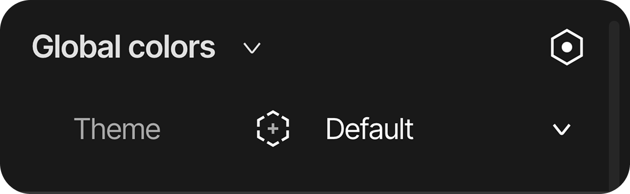
Global colors
This section is used to set up global color sets to create different themes.
-
Theme: Global colors theme selector.
For more information about Global colors, see the [Global colors](global colors.md) section.
Layout
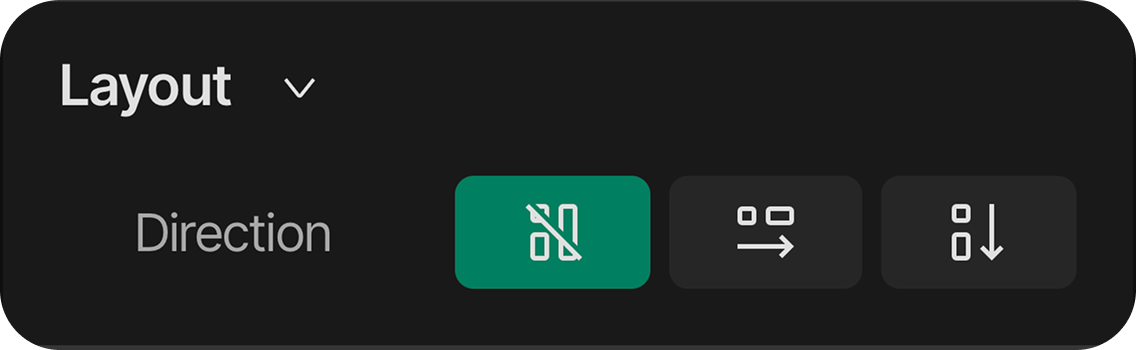
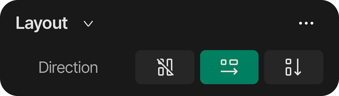
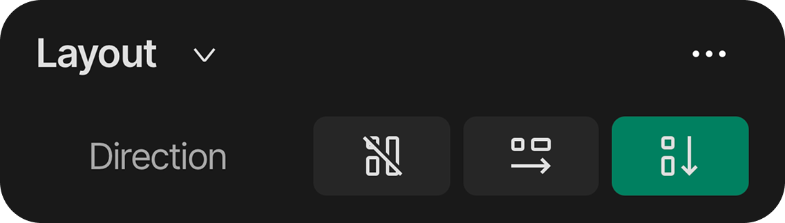
Layout can be used to control how elements are arranged in relation to each other.
Layout toggles between three modes:
- Default mode: In this layout mode there is no correlation between different widgets and assets. Elements can be moved freely on the selected screen.
- Horizontal mode: This layout mode arranges the elements in a horizontal manner.
- Vertical mode: This layout mode arranges the elements in a vertical manner.
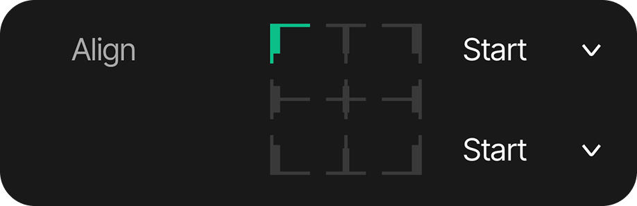
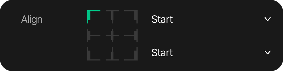
Align: Alignment options for content positioning using a 9-point position grid.
-
Position Grid: A visual guide on the right showing positioning options. Clicking on different points of this grid aligns the element relative to its parent. (Grid parameters can also be set through the dropdown lists beside the grid)
-
Top-left: Aligns the element to the top-left
-
Top-mid: Centers the element horizontally while aligning it to the top
-
Top-right: Aligns the element to the top-right
-
Mid-left: Centers the element vertically while aligning it to the left
-
Center: Centers the element both horizontally and vertically
-
Mid-right: Centers the element vertically while aligning it to the right
-
Bottom-left: Aligns the element to the bottom-left
-
Bottom-mid: Centers the element horizontally while aligning it to the bottom
-
Bottom-right: Aligns the element to the bottom-right
-
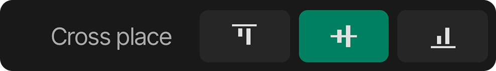
Cross place: Configures cross axis alignment settings, If differently sized elements are in the layout, this will align the smaller element in the desired position. This has three states:
-
Top: Smaller items align to top position.
-
Mid: Smaller items align to middle position.
-
Bottom: Smaller items align to bottom position.
Wrap: Toggle content wrapping.
Reverse: Reverse the direction of items
Gap: Sets the space between items
-
Horizontal value
-
Vertical value
Transformation
-
X: Sets the horizontal position of the element relative to its parent
-
Y: Sets the vertical position of the element relative to its parent
-
Unit Selector: Dropdown to switch between different measurement units:
- PX - Pixels (relative to Position Grid)
- % - Percentage (relative to Position Grid)
-
Position Grid: A visual guide on the right showing positioning options. Clicking on different points of this grid aligns the element relative to its parent:
- Top-left: Aligns the element to the top-left
- Top-mid: Centers the element horizontally while aligning it to the top
- Top-right: Aligns the element to the top-right
- Mid-left: Centers the element vertically while aligning it to the left
- Center: Centers the element both horizontally and vertically
- Mid-right: Centers the element vertically while aligning it to the right
- Bottom-left: Aligns the element to the bottom-left
- Bottom-mid: Centers the element horizontally while aligning it to the bottom
- Bottom-right: Aligns the element to the bottom-right
Layer
It defines the layer's opacity and how elements visually mix with layers beneath them through different blending modes.
-
Opacity: Transparency level for blending
-
Mode: Choose from four blending mode options -
- Normal
- Additive
- Subtractive
- Multiply

Size controls
-
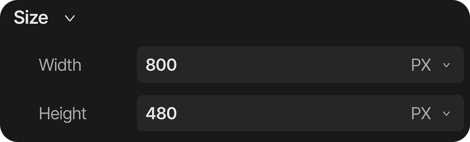
Width: Sets the width of the element in pixels (PX), percentage (%), or content-based sizing
-
Height: Sets the height of the element in pixels (PX), percentage (%), or content-based sizing
-
Unit Selector: Dropdown to switch between different measurement units:
- PX - Pixels (absolute size)
- % - Percentage (relative to parent)
- content - Content-based sizing
States
The States section allows the management of different visual states of the element. This section shows:
- Default State: The standard appearance of the element
- Add State Button (+): Adds additional states to the element
For more detailed information about States, refer to the States section.
Flags
The Flags section is the place to set special behaviors and attributes for elements. This section includes:
- Add Flags Button (+): Adds flags to control element behavior
For more detailed information about Flags, refer to the Flags section.
Scrolling
The Scrolling section is dedicated to configuring the scrolling attributes for different elements
- Add scrolling button (+): Add scrolling attributes to enable different scrolling types.
For more detailed information about Scrolling, refer to the Scrolling section.
Styles
The Styles section allows users to customize the visual appearance of UI elements. This section enables:
- Style modification: Apply and customize styles for different element states
- Global styles: Create or choose from saved styles in the project
- Add style button (+): Adds new style properties to the selected element
For more detailed information about Styles and their application across different states, refer to the Styles section.