Actions
Event Actions define the responses that occur after a trigger is detected, turning user interactions into visible changes in the UI. They span from basic adjustments (changing opacity, updating text) to sophisticated behaviors (transitioning between screens, playing animations), with each action offering customizable settings to precisely control the outcome.
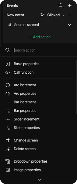
Create an action After configuring the event trigger and source, you define what happens when the event occurs by adding actions:
- Click "Add action"
- Choose an action type from the extensive menu
- Configure the action's parameters according to the specific requirements.

Action configuration
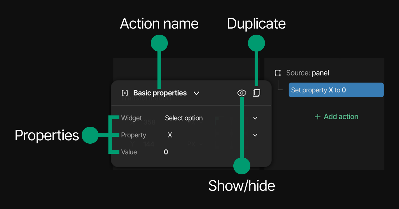
- Modify action types anytime via dropdown menus
- Hide/show actions with the eye icon
- Duplicate actions quickly using the rectangles icon
- Customize action properties to fine-tune event behavior
- Remove added actions from triggers using the minus icon
- Add unlimited actions to create sophisticated interaction flows

Available actions
Basic properties
Modifies core widget attributes to change how elements look or behave directly.
- Widget - The target widget to modify
- Property - The property to change
- X
- Y
- Width
- Height
- Value - The new value to set
Call function
Executes custom code functions for complex behaviors not available through standard actions.
- Function name - The name of the function to call
Arc increment
Changes arc widget value incrementally for dynamic adjustments to circular indicators.
- Widget - The target arc widget
- Value - The amount to increment or decrement
Arc properties
Modifies arc widget settings directly.
- Widget - The target arc widget
- Property - The property to modify
- Value - The new value to set
Bar increment
Adjusts bar widget value incrementally for interactive progress bars.
- Widget - The target bar widget
- Property - The property to modify
- Value
- Value with animation
- Value - The amount to increment or decrement
Bar properties
Changes bar widget settings for controlling linear indicators.
- Widget - The target bar widget
- Property - The property to modify
- Value
- Value with animation
- Value - The new value to set
Slider increment
Modifies slider value incrementally for interactive controls.
- Widget - The target slider widget
- Property - The property to modify
- Value
- Value with animation
- Value - The amount to increment or decrement
Slider properties
Adjusts slider settings directly.
- Widget - The target slider widget
- Property - The property to modify
- Value
- Value with animation
- Value - The new value to set
Change screen
Navigates between screens with customizable transitions.
- Screen to - The destination screen
- Fade mode - The transition animation type
- Move left
- Move right
- Move top
- Move bottom
- Over left
- Over right
- Over top
- Over bottom
- Fade on
- None
- Speed - The transition speed
- Delay - The time before transition starts
Delete screen
Removes a screen from the application.
- Screen - The screen to delete
Dropdown properties
Modifies dropdown widget settings.
- Widget - The target dropdown widget
- Property - The property to modify
- Value - The new value to set
Image properties
Changes image attributes like rotation angle.
- Widget - The target image widget
- Property - The property to modify
- Angle
- Zoom
- Value - The new value to set
Label properties
Modifies label content and attributes.
- Widget - The target label widget
- Property - The property to modify
- Value - The new text content
Roller properties
Adjusts roller widget settings for scrollable option selectors.
- Widget - The target roller widget
- Property - The property to modify
- Value
- Value with animation
- Value - The new value to set
Modify flag
Changes widget flags that control fundamental behaviors.
- Widget - The target widget
- Flag - The flag to modify. See all available flags here
- Action - How to modify the flag
- Add - Add a flag
- Remove - Remove a flag
- Toggle - Use a flag from another state
Modify state
Adjusts widget states to create visual feedback.
- Widget - The target widget
- State - The state to modify
- Action - How to modify the state
- Add - Add a state
- Remove - Remove a state
- Toggle - Use a state from another state
Move cursor
Repositions cursor or focus point.
- Widget - The target widget
- Direction - Where to move the cursor
- Right
- Down
- Left
Play animation
Runs predefined animations for engaging visual effects.
- Animation - The animation to play
Set opacity
Changes widget transparency level.
- Widget - The target widget
- Opacity - The opacity level (0-100)
Set text value from arc
Displays arc widget value as text on a label.
- Target - The label widget to display the value on
- Source - The arc widget value to be displayed
- Prefix - The text before the value
- Postfix - The text after the value
Set text value from slider
Displays slider widget value on a label.
- Target - The label widget to display the value on
- Source - The slider widget value to be displayed
- Prefix - The text before the value
- Postfix - The text after the value
Keyboard set target
Redirects keyboard input to a specific widget.
- Widget - The widget to receive keyboard input
Step spinbox
Increments or decrements spinbox values.
- Widget - The target spinbox widget
- Direction - Increase or decrease the value
- Increment
- Decrement
Switch theme
Switches the global variable theme of the project.
- Theme - The target global variable theme