States
Using States allows the definiton on different visual and behavioral conditions for UI elements. Using states, interactive components can be created that respond to user actions like clicks, checks, or focus events.
Accessing states
The States section is located in the Inspector panel when an element is selected. Each element has a "Default" state by default, and additional states can be added as needed.
Available states
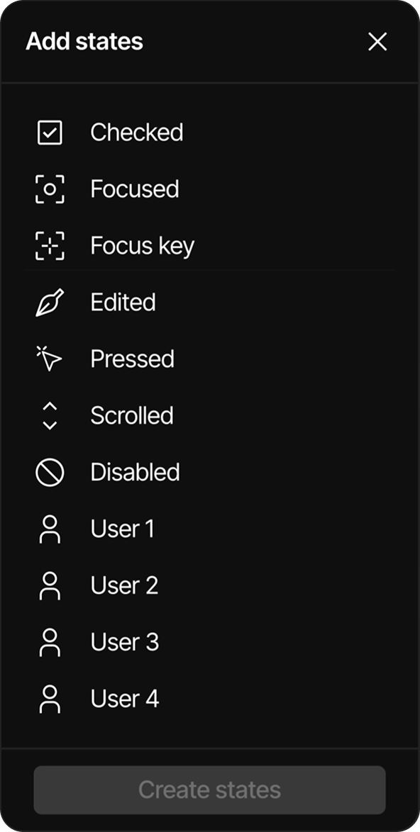
The Editor offers the following states:
- Default: The standard appearance of an element
- Checked: Applied when a checkbox, radio button, or similar element is selected
- Focused: Applied when an element receives focus (e.g., via keyboard navigation)
- Focus key: Applied when an element is focused using a key
- Edited: Applied to input fields or text areas that have been modified
- Pressed: Applied when an element is being clicked/pressed
- Scrolled: Applied to scrollable elements that have been scrolled
- Disabled: Applied when an element is not interactive
- User 1-4: Custom states that can be defined by the user for specific needs
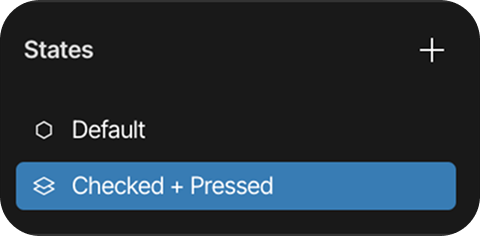
Combined states
States can be combined to create more complex interactions, for example:
- Checked + Pressed: Applied when a checked element is also being pressed
Adding states
To add states to an element:
- Select the element in the canvas
- In the Inspector panel, locate the States section
- Click the "+" button to the right of the States header
- A list titled "Add states" will appear
- Use the search bar at the top to filter available states if needed
- Click on one or more states to select them (selected states will appear with a green checkmark)
- Click the "Create states" button at the bottom of the dialog
- The selected states will be added to the element in the States section
State combinations:
- If only one state is selected from the list, it will be added as an individual state
- If multiple states are selected at once (e.g., "Checked" and "Pressed"), the system will automatically create combined states
- Any combination of states can be created by selecting them simultaneously in the Add states list
- States that have already been added to an element cannot be added again
Removing states
To remove a state from an element:
- Select the element in the canvas
- In the Inspector panel, locate the States section
- Find the state to be removed
- Click the "-" button that appears on the right side of the state row
Customizing states
Each state can be customized with different visual properties. When a state is selected in the States panel:
- The element's appearance can be modified specifically for that state
- Changes will only apply to the selected state
- For more advanced styling options, the Styles panel can be used
- Global styles can be applied to maintain consistency
- Different Style types can be used to customize properties like colors, typography, and transitions