Flags
Flags define special behaviors and characteristics for UI elements. They allow users to enable or disable specific functionality for screens, containers, and widgets without writing code.
Accessing flags
The Flags section is located in the Inspector panel below the States section. Each element can have multiple flags applied simultaneously.
Adding flags
To add flags to an element:
- Select the element in the canvas
- In the Inspector panel, locate the Flags section
- Click the "+" button to the right of the Flags header
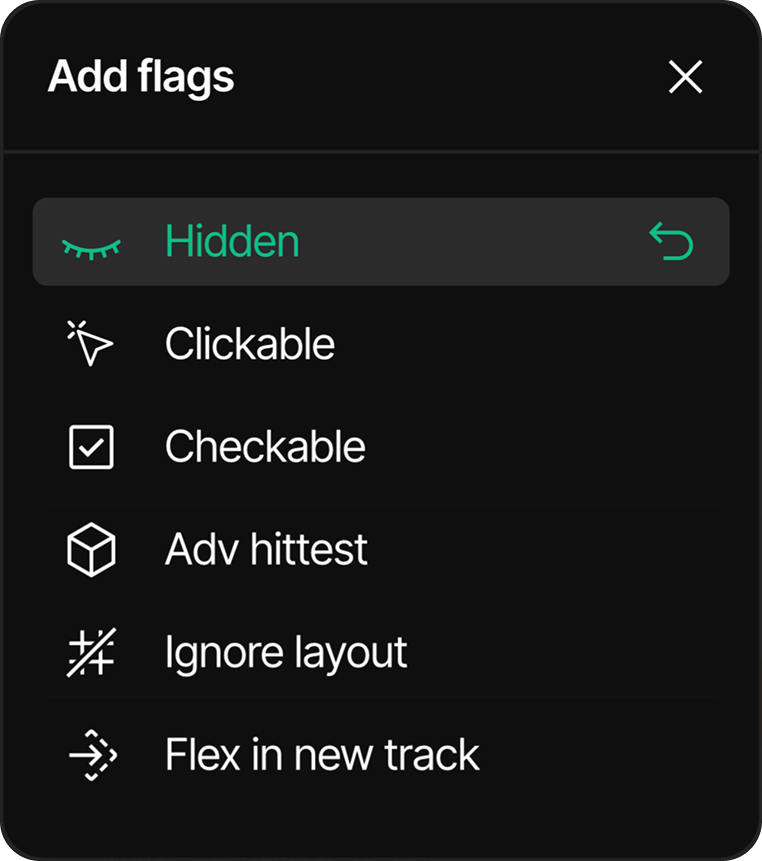
- A list titled "Add flags" will appear
- Use the search bar at the top to filter available flags if needed
- Click on one or more flags to select them (selected flags will appear with a green icon and green background)
- Once the desired flags are selected, close the dialog by clicking the X in the top-right corner or clicking outside the list
- The selected flags will be added to the element in the Flags section
Toggling flags
Once flags are added to an element, they appear in the Flags section with On/Off toggle buttons:
- Click "On" to enable the flag
- Click "Off" to disable the flag

Available flags
Element behavior flags
-
Hidden: Makes the element invisible in the UI
-
Clickable: Allows the element to receive click/tap events
-
Checkable: Allows the element to be toggled on and off (for checkboxes, toggles, etc.)
-
Adv hittest: Enables advanced hit testing for complex shapes
-
Ignore layout: Excludes the element from automatic layout calculations
-
Flex in new track: Creates a new flex layout track for the element
Removing flags
To remove a flag from an element:
- Click the "+" button to open the "Add flags" list
- Find the flag that needs to be removed (flags that are already added will have a green background and icon)
- Click on the flag needs to be removed (this will deselect it)
- Close the dialog by clicking the X in the top-right corner or clicking outside the list
- The deselected flag will be removed from the Flags section in the Inspector