Styles
The Styles panel provides a powerful way to control the appearance of UI elements. Styles allow visual properties to be defined and managed consistently across a project, making it easier to create cohesive designs and implement changes efficiently.
Styles section
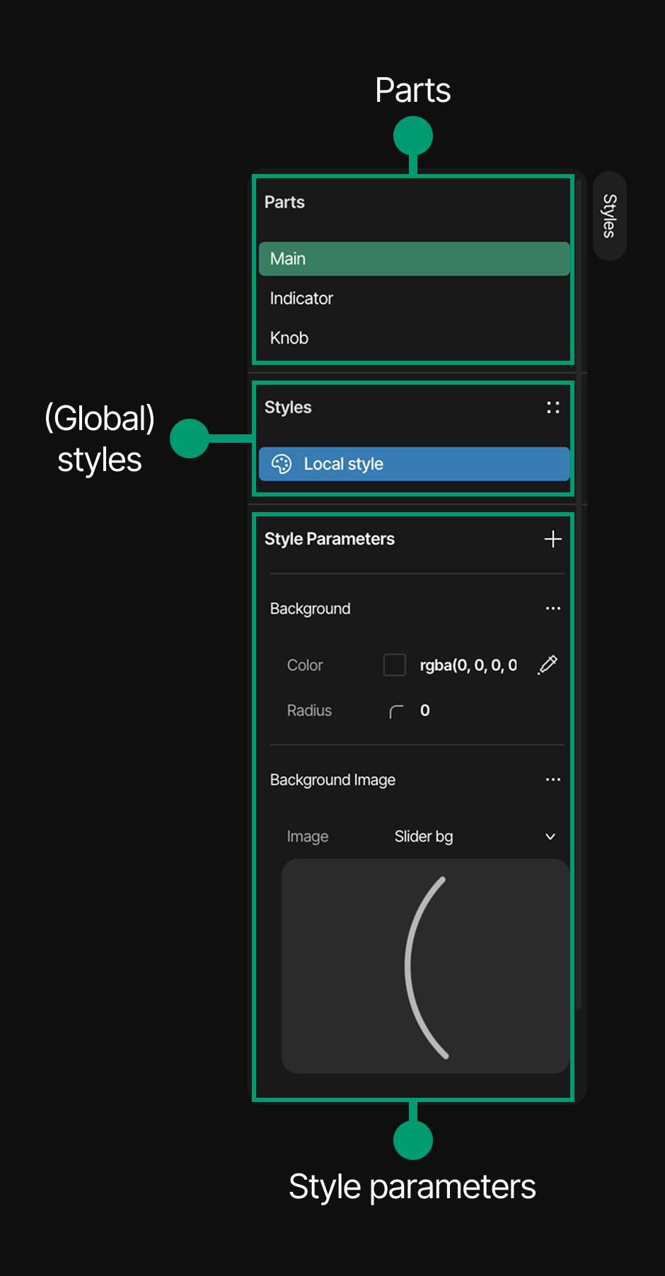
The Styles panel is located at the bottom of the Inspector. This section is organized into three key areas:
- Parts: Shows the widget parts that can be styled - this depends on the widget type and what it currently indicates. The following options may be available:
- Main
- Items
- Indicator
- List scrollbar
- List Selected
- List Main
- Knob
- Cursor
- Textarea
- Placeholder
- Styles: Displays the created global styles. The default is Local style
- Style Parameters: Lists all style properties that can be customized
Adding Style Parameters
To add style parameters to an element:
- Select an element in the canvas
- In the Styles panel, locate the "Style Parameters" section
- Click the "+" or the Add style parameters button
- A list will appear with available style parameter categories
- Use the search bar at the top to filter parameters if needed
- Select the desired parameter category from the list
- The selected parameter will be added to the Style Parameters section
💡 TIP When a Style parameter is added, in most cases only its essential elements are included in the Style Parameters group. To add special or advanced elements, click on the three dots next to the Style parameter title to reveal additional style options. For more information,visit the Style Style types documentation.
Removing Style Parameters
Option A: To remove a style parameter:
- Open the style list using the "+" button next to Style Parameters
- Look for the green highlighted options (previously added styles)
- Click on one of these green options
- The style parameter will be deleted from the widget's style
Option B: To remove all style parameters at once:
- Hover over the Local style under the Styles section and click on the arrow icon
- All previously added style parameters will be deleted
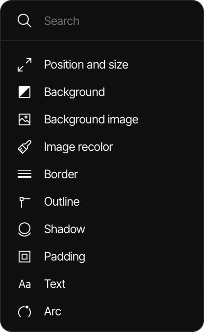
Available Style Parameters
The following style parameter categories are available:
- Position and size: Controls the element's dimensions and placement
- Background: Sets the background color and properties
- Background image: Adds and configures a background image
- Image recolor: Adjusts colors of images
- Border: Configures border properties
- Outline: Sets outline properties separate from borders
- Shadow: Adds and customizes shadow effects
- Padding: Adjusts inner spacing of the element
- Text: Controls typography properties
- Arc: Configures curved properties for applicable elements