Style types
Styles allow users to customize the appearance of your widgets. They define how widgets and their elements look and which visual effects are applied to them.
Position And Size
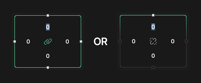
Defines the dimensions, placement, scaling, and rotation of elements.
- Min. width: Sets the minimum width the element can shrink to
- Max. width: Sets the maximum width the element can expand to
- Min. height: Sets the minimum height the element can shrink to
- Max. height: Sets the maximum height the element can expand to
- Transf. W: Width transformation value
- Transf. H: Height transformation value
- Translate X: Horizontal position offset
- Translate Y: Vertical position offset
- Scale X: Horizontal scaling factor (256 = 100%)
- Scale Y: Vertical scaling factor (256 = 100%)
- Rotation: Rotation angle in degrees
- Pivot X: X-coordinate of the rotation center point
- Pivot Y: Y-coordinate of the rotation center point
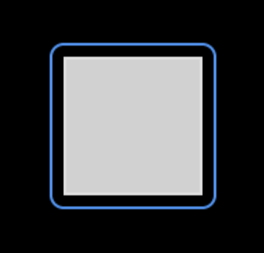
Background
Background defines the background colors, gradients, and corner properties of elements.
- Color: Sets the background color, gradient or alpha of the object.
- Clip corner: Determines if content is clipped at rounded corners
- Radius: Corner radius for rounded corners

Background Image
This allows images to be set as backgrounds with controls for opacity and tiling.
- Image: Selects an image to use as background
- Opacity: Transparency level of the background image
- Recolor: Applies a color overlay to the image
- Tiled: Repeat the image to fill the area

Image Recolor
Image Recolor allows color overlays to be applied to modify the appearance of images.
- Recolor: Color to apply over images
Border
It defines the color, width, and position of borders around the inner edges of elements.
- Fill: Border color
- Width: Border thickness
- Border Sides: Click on the green chain link icon to adjust sides individually, or the gray chain link icon to adjust all sides simultaneously, then select which sides get borders

Outline
Outline is similar to Border but creates lines around the outer edges of elements with padding control.
- Color: Outline color
- Width: Outline thickness
- Pad: Distance between outline and element
Shadow
This creates shadow or glow effects with customizable color, position, and intensity.
- Color: Shadow color
- Axis: X and Y offset values for the shadow
- Effects: Shadow spread and blur settings
Padding
Padding style adds space inside the widget's boundaries. This creates distance between the widget's edge and its contents, measured in pixels.
- Width: Internal spacing within the element (top, right, bottom, left values)
- Border Sides: Click on the green chain link icon to adjust sides individually, or the gray chain link icon to adjust all sides simultaneously, then select which sides get padding
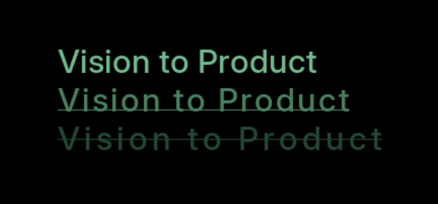
Text
Text style allows users to customize typography including font, color, spacing, alignment, and decorations.
- Font: Typography selection
- Color: Text color
- Spacing: Letter and line spacing controls
- Align: Text alignment options -
- Left
- Center
- Right
- Decor: Text decoration options -
- Underline
- Strikethrough
- Overline
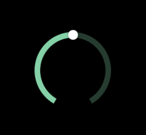
Arc
Arc can be used to style curved elements with controls for color, width, and end-cap appearance in those widgets that contain the Arc component.
- Color: Arc line color
- Width: Arc thickness
- Rounded: Toggles for rounded arc ends
- Image: Selects an image for the arc