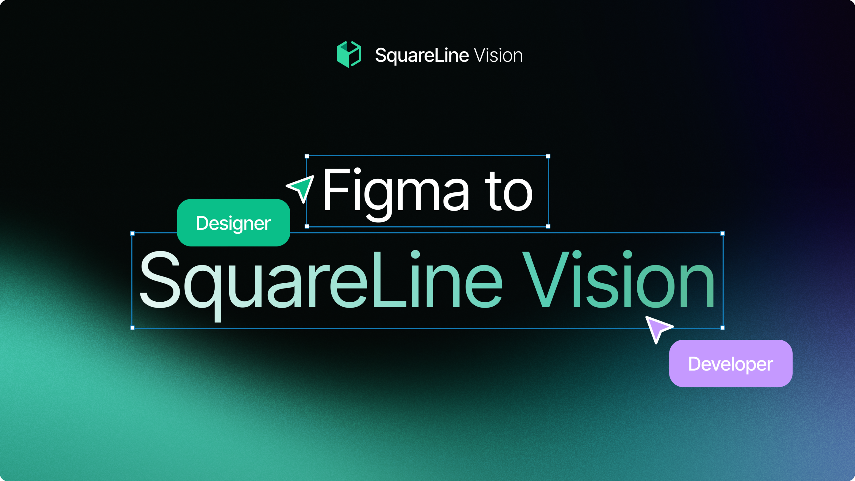
Figma to SquareLine Vision
The SquareLine Vision Figma Plugin allows the user to instantly convert your Figma-designed UI elements into fully functional widgets inside Vision. Vision builds each widget according to the styles defined in Figma (colors, sizes, border radius, alignment, text styles, etc.), ensuring that what the user sees in Figma is exactly what you get inside Vision.
Important!
To achieve exactly the same result in SquareLine Vision as in Figma, the Vision project must be created with the Simplified LVGL theme. Projects created with the light or dark theme contain their own styles, which will cause the result to differ.
Plugin Resources:
Use the widgets found in the UI Kit as a reference to ensure SquareLine Vision recognizes them as the correct widget.
Figma to SquareLine Vision tutorial video
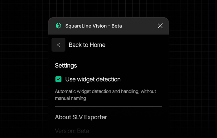
Widget Detection
Widget Detection is a core feature of the Vision Figma Plugin. It automatically analyzes the users Figma design and attempts to identify common UI patterns, converting them into the appropriate widget types inside Vision. This feature speeds up workflow and reduces manual setup.
Widget Detection is enabled (default)
With Widget Detection enabled, your Figma design is instantly interpreted as interactive components in Vision.
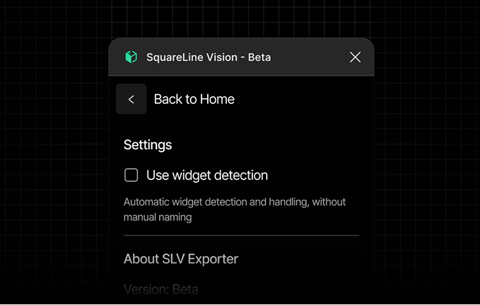
Widget Detection is disabled
If disabled, Vision does not attempt to recognize widgets. Instead, it only generates primitives, giving you full control to manually build your interface:
- Container
- Label
- Image
- Screen
This mode is useful if the user wants to create custom widgets or prefers to control every detail of the UI setup.
Manual Widget Definition (Override)
the user has the option to manually determine the widget type, overriding the automatic Widget Detection. To do this, simply add the desired LVGL widget name to the layer name in Figma using the # prefix.
When a valid widget name is found in the layer name (e.g., #panel, #button, #label), Vision will ignore the visual structure and force the element to be converted as the specified widget type.
Example:
If the user has a complex slider structure but want it to be exported as a simple Panel (without slider functionality), rename the top-level element of the slider in Figma to include #panel (e.g., VolumeSlider #panel). In this case, the element will be generated as a Panel widget in Vision.
Widgets
Screen

The Screen parts:
1. Main (Frame)
The main Frame, which is not inside any other Frame and only contains elements, will function as the Screen.
Panel

The Panel parts:
1. Main (Frame)
The Panel widget in Figma consists of a single Rectangle.
Container

The Container parts:
1. Main (Frame)
The Container widget is a Figma Frame placed inside the main (parent-screen) Frame.
Image
The Image parts:
1. Main (Frame)
The Image element consists of a single part: the Main, which provides the image display.
To ensure the image displays with the correct proportions in both Figma and Vision, the element’s Fill must not be set to Fit or Cropped.
To ensure an image appears exactly the same in Vision as in Figma, both the image’s dimensions and resolution must match the intended size.
For example, if the final size is 280×240 px:
A 6166×3456 px image simply scaled down to 280×240 px will not display correctly in Vision.
Tips:
Correct approach: export the image from Figma as a 1× PNG at 280×240 px. This ensures the Vision image widget uses the exact intended dimensions and proportions.
Label

The Label parts:
1. Main (Text)
A Label consists of a single part: the Main. The Main itself is the text, so the Label has no additional components.
Tips:
If the user selects a font in Figma, Vision will use Montserrat by default. However, it will preserve the text’s size and style. To display the chosen font, upload the font file to Assets and select the appropriate .ttf file.
Textarea

The Textarea is composed of two parts:
1. Main (AutoLayout)
2. Label (Text)
It’s important that the text element’s alignment is set to left. When placed inside an Auto Layout with left alignment, it will function as a textarea widget.
Button

The Button is composed of two parts:
1. Main (AutoLayout)
2. Label (Text)
When the user places a text element inside an Auto Layout and sets its alignment to center, it will behave as a button widget.
If the user wants to include an icon in the button, it can be easily added: place a Vector icon before or after the label, and Vision will automatically treat it as an asset.
Tips
If the user wants to create a simple icon button, just hide the label in Vision the button will automatically behave as an icon button.
Important!
Make sure the text element is center-aligned for the button widget to function correctly.
Checkbox
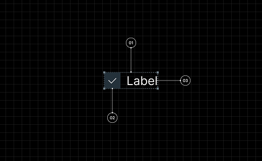
The Checkbox is composed of three main parts:
1. Main (Group, Frame or AutoLayout)
2. Indicator (Frame with Rectangle and Vector)
3. Label (Text)
For the checkbox to function properly as a widget, the Indicator and Label elements need to be placed inside a single Group, Frame, or Auto Layout. This combined structure forms the main part of the checkbox.
The Indicator must be a Frame that contains two child elements:
- a Rectangle, which defines the visual appearance of the checkbox box, and
- a Vector, which can be visible or hidden — this represents the checkmark graphic.
If the user don’t want the checkbox to have a label, set the Label’s text to a single space character. You can then hide the Label layer in Figma; in Vision, the checkbox will appear with an empty label.
Important
Although the Vector element must exist within the Indicator in Figma, Vision’s default state will not display this Vector.
Switch

The Switch is composed of three main parts:
1. Main (Group or Frame)
2. Indicator (Ellipse or Rectangle)
3. Knob (Ellipse or Rectangle)
For the switch to function properly as a widget, the Indicator and Knob need to be placed inside a single Group or Frame. This Group or Frame will serve as the main part of the switch.
Slider

The Slider is composed of three main parts:
1. Indicator (Rectangle)
2. Knob (Ellipse or Rectangle)
To ensure the slider works properly as a widget, all of its parts need to be placed inside a single Group or Frame.
Tips
If the user don’t want the Knob to be visible in the slider, set its fill to 0% or reduce the layer opacity to 0%. It’s important that the Knob remains part of the widget, even when it is visually hidden.
Arc widget
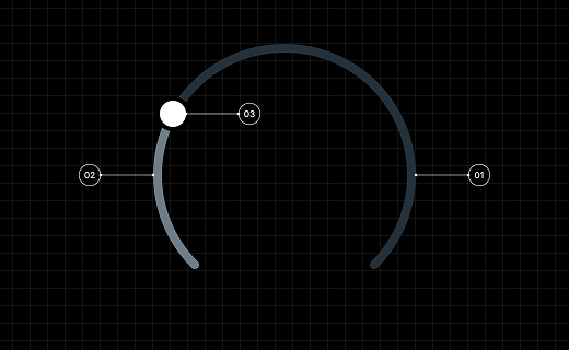
The Arc is composed of three main parts:
1. Main (Ellipse)
2. Indicator (Ellipse)
3. Knob (Ellipse or Rectangle)
To ensure the arc works correctly as a widget, all three elements must be placed inside a single Group or Frame. Without grouping them, the widget’s interactions (such as adjusting values using the Knob) may not function as expected.
Tips
If the user don’t want the Knob to be visible on the arc, set its fill to 0% or reduce the layer opacity to 0%. It’s important that the Knob remains part of the widget, even when it is visually hidden.
Bar

The Bar is composed of two main parts:
1. Main (Rectangle)
2. Indicator (Rectangle)
To ensure the bar works properly as a widget, all of its parts need to be placed inside a single Frame.
Roller
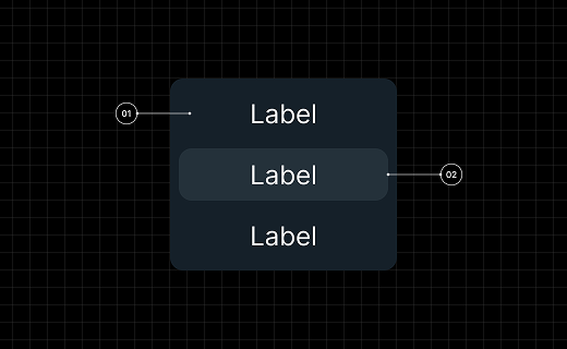
The Roller is composed of two main parts:
1. Main (AutoLayout with Label)
2. List selected (AutoLayout with Label)
For the Roller widget, place all list items inside an Auto Layout.
- Each item should be its own Auto Layout containing a single Label.
- The parent Auto Layout that holds all items defines the Main part.
- The item that contains only a Label and has a filled style will represent the Selected part.
Tips
If a Label inside the Roller widget has Auto Line Height in Figma, Vision will set the line height to 0. To ensure the same appearance in Vision, assign a fixed Line Height to your font in Figma.
Dropdown
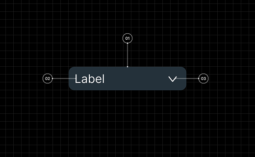
The Dropdown is composed of three main parts:
1. Main (AutoLayout)
2. Label (Label)
3. Icon (Vector)
In Figma, a Dropdown widget consists of a Label and a vector Icon placed together inside an Auto Layout. This Auto Layout forms the Dropdown itself.
Tips
The user don’t need to create the dropdown panel separately in Figma, as its appearance will be derived from the main Dropdown’s style. You can freely customize the dropdown content in Vision.
Supported Style Parameters
The SquareLine Viison Figma plugin supports and converts the following Figma style settings into SquareLine Vision compatible formats.
Background
The plugin processes the fills properties.
-
Solid Colors:
-
Conversion: Mapped to
backgroundColorin solid mode. -
Color Values: RGB values are converted from the 0-1 range to the 0-255 range.
-
Opacity: Preserved via the alpha channel.
-
-
Gradient Colors:
-
Type: Only
GRADIENT_LINEARtypes are supported. -
Conversion: Mapped to
backgroundColorin gradient mode. -
Direction: Calculated as Horizontal (
hor) or Vertical (ver) based on handle positions, with a reversed flag if necessary. -
Stops: Gradient stop positions are converted to percentage points.
-
Border & Outline
Based on the Figma strokes property, the stroke alignment determines the output type.
-
Border:
-
Condition: Strokes aligned to
INSIDE. -
Conversion: Mapped to
borderColorandborderWidth.
-
-
Outline:
-
Condition: Strokes aligned to
OUTSIDE. -
Conversion: Mapped to
outlineColor,outlineWidth, andoutlinePad.
-
-
Corner Radius:
-
Figma's
cornerRadiusis directly converted to the SquareLineradiusproperty. -
For ellipses, the radius is calculated from the dimensions.
-
Shadows
Effects with the type DROP_SHADOW are processed.
-
Converted Parameters:
-
Color (RGB + Alpha) and Offset (X, Y).
-
Blur radius: Exported as
shadowWidth. -
Spread: Exported as
shadowSpread.
-
Typography
Text element styles are mapped as follows:
-
Font:
-
Family: Spaces in font names are replaced by underscores.
-
Size & Weight: Preserved as numeric values.
-
-
Spacing:
-
Letter Spacing: Converted from Figma units to SquareLine units.
-
Line Height:
AUTObecomes 0; fixed values are rounded to the nearest integer.
-
-
Color:
SOLIDtext fills are converted to thetextColorproperty. -
Alignment: Horizontal alignment (Left, Center, Right, Justified) is preserved as
textAlign.
Layout & Flexbox
Figma Auto Layout settings are converted into Flex layout properties.
-
Type:
layoutModedetermines thelayouttype (FLEX). -
Direction: Horizontal $\rightarrow$
ROW, Vertical $\rightarrow$COLUMN. -
Gap: Item spacing is converted to
gapvalues. -
Padding: Top, Right, Bottom, and Left padding are converted to
paddingWidthwithsideType: "different". -
Sizing & Alignment:
-
layoutSizing: HUG$\rightarrow$ Content-based units. -
layoutAlign: STRETCH$\rightarrow$ Percentage-based units. -
layoutGrow$\rightarrow$flexGrow(fractional units). -
Alignment: Primary and counter axis alignments are mapped to their respective horizontal/vertical alignment properties.
-
Other Effects & Transforms
-
Blend Modes & Opacity:
-
blendMode: Modes likeMULTIPLYare preserved;PASS_THROUGHis converted toNORMAL. -
opacity: Converted to a 0-255 scale.
-
-
Rotation:
-
Degrees are converted to tenths of degrees (e.g., 45° $\rightarrow$ 450).
-
The pivot point is set to the center of the element.
-