Quickstart Guide
Welcome to the SquareLine Vision Quick Start Guide! This guide is designed for beginners ready to create their first SquareLine Vision project. In this tutorial, you'll develop a screen where users can adjust and set precise temperature values on a smart thermostat interface.
This quickstart offers a hands-on, beginner-friendly approach, covering essential Vision elements efficiently. For a more comprehensive exploration of Vision's features and capabilities, we suggest exploring the detailed SquareLine Vision concepts documentation.
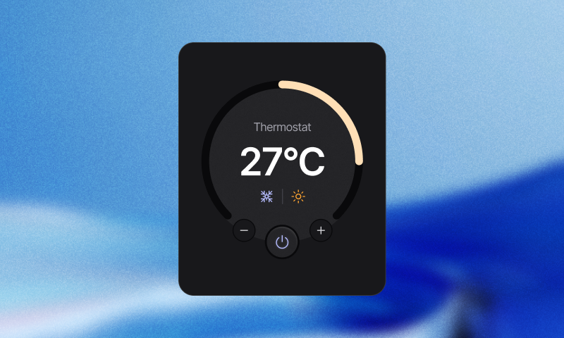
Here's a preview of your finished embedded UI design:

What you'll learn
- Creating widgets and layouts
- Adding interactivity to UI elements
- Handle app behavior in response to user interactions (manage events).
- Running your app
The steps to build the app are as follows:
1. Fork or create project
To begin your journey, start by creating a new project. For your convenience, we've prepared a foundation project. Just access the provided link and select the 'Fork' option, and the template will automatically appear in your personal launcher.

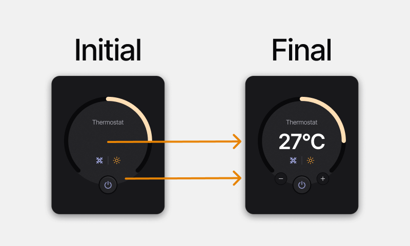
After forking the project, you will see an initial thermostat app design that has already been started. You'll implement functionality that enables users to update the thermostat temperature value by pressing the plus and minus buttons.

2. Creating widgets
In this part, we'll explore the process of constructing the user interface (UI) for this functionality. This encompasses designing a layout and incorporating different widgets into our page.
To build the UI:
- Add a container, a button, and a label widget to your workspace.
- Using drag and drop functionality, place the button inside the container widget. The container will serve as the parent widget.
- Double-click on the button in the hierarchy panel and rename it to "Decrease". Similarly, rename the Container widget to "Buttons" and the label to "Value".
- Set the container's width to 140px. Change the height dropdown to "content".
- Resize the button to 32px width and height.
- Drag the "Buttons" container into the "Controller" arc widget, then align it to Bottom mid position.
- Change the Value label's title to "23°C" in the Inspector panel.
- Drag the"Value" label into the "Controller" arc widget. Align it to Center.
Video about Creating Widgets
3. Customize styles and states
The next step is to customize the style and states of UI elements. This section encompasses modifying the default and pressed states of widgets, including adjustments to their backgrounds, text elements, borders, and layouts for both buttons and labels. In SquareLine Vision, you can do these via the Styles Panel and Inspector Panel's States part which provides a range of options for customization.
3.1 Add style and state parameters
- Select the "Value" label in the Hierarchy Panel, then open the Styles Panel by clicking on the Styles Tab.
- Click on the + button next to the Style Parameters label and add the Text option from the dropdown list.
- From the Text - Font dropdown, select the H1 option. Click on the Color field and enter #ffffff in the HEX field.
- Select the "Decrease" button in the Hierarchy.
- Click on the + button next to the Style Parameters label and add the Background, Background Image, and Border options from the dropdown list.
- Click on the Background - Color field and enter #18181b in the HEX field.
- Enter 33 in the Background - Radius field.
- Click on the Background Image - Image dropdown menu and select the image named "Minus".
- Click on the Border - Fill field and enter #0c0c0e in the HEX field. Enter 1 for the Border - Width.
- In the Inspector Panel, click on the + button next to States and select the Pressed option, then click the Create states button.
- Click on the + button next to Style Parameters and add the Background option from the dropdown list.
- Click on the Background - Color field and enter #2c2c2f in the HEX field.
- Enter 33 in the Background - Radius field.
Video about Add style and state parameters
3.2 Add layout parameters
-
In the Inspector Panel, select the Default state for the "Decrease" button, then click on the widget duplication icon in the Hierarchy.
-
Double-click on the duplicated button in the Hierarchy and rename it to "Increase".
-
In the Styles Panel, click on the Background Image - Image dropdown menu and select the image named "Add".
-
Select the "Buttons" container widget and click on the + button in the Styles Panel to add the Layout option from the dropdown list.
-
From the Align dropdown, select the Space between option.
Video about Add layout parameters
4. Manage events
After your UI is built, it's time to make your app interactive by adding Events. This means your app will respond to user interactions once you've configured the appropriate parameters. For example, when a user clicks the plus button to increase the temperature, the number on the display will increase accordingly.
-
Select the "Decrease" button, then click on the Events tab.
-
Click on the + button to create a new event.
-
Click on the Trigger dropdown and select the Clicked option.
-
Click on the + Add action button, then select the Set text value from arc option from the list.
-
For the Target, select the "Controller" arc widget. For the Source, select "Value" label.
-
In the Postfix field, enter: °C
-
Click again on the + Add action button, then select the Arc increment option from the list.
-
From the Widget dropdown, select Controller. In the Value field, enter: -1
-
Repeat these same steps with the Increase button selected. Important: for the Arc increment action, enter 1 in the Value field this time.
Video about Manage Events
5. Play mode
Once you've built and customized your app, it's time to run it in a live environment. SquareLine Vision allows you to test a fully functional version of your application using Play mode. The Play mode may require more time depending on the size of your project.
Video about Play mode