Global Colors
Global color variables allow you to manage your project's color scheme efficiently. By defining colors as variables, you can update them in one place and have the changes apply automatically across your entire user interface. This guide explains how to create and manage global colors using the Variable Manager and Color Picker.
Managing Variables and Themes
Accessing the Variable Manager
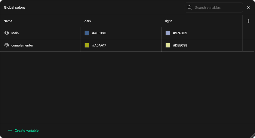
You can find the Variable Manager in the Inspector panel. When you open it for the first time, the list will be empty, as all element colors are initially set manually.
Creating and Naming a Color Variable
-
In the Variable Manager, click the Create variable button.
-
A new color variable is created and assigned to your first theme.
-
Give the variable an identifiable name, such as
Primary,Accent, orBackground. You can also name your theme to better organize your designs. -
Assign a solid or gradient value to the color. You can add as many variables to a theme as needed and modify their values at any point during the design process.
Adding a New Theme
You can create multiple themes for your project.
-
Click the Add new theme button.
-
A new theme is created, and the system automatically copies all existing color variables from the previous theme.
-
You can now assign new color values to these variables, which will be specific to the new theme.
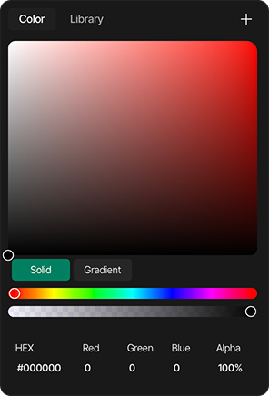
Applying and Editing Colors Using the Color Picker
How to Select a Color
You can define a color by following these steps:
-
Select a Hue: Click and drag the circular handle on the hue slider (the top rainbow-colored bar) to choose the base color.
-
Adjust Saturation & Brightness: Move the selector within the large square color field to fine-tune the color's saturation (left to right) and brightness (bottom to top).
-
Set Transparency: Use the bottom slider to control the alpha (transparency) of the color. A checkerboard pattern indicates the level of transparency.
-
Enter Precise Values: For exact color codes, you can manually type values into the HEX, Red, Green, Blue, and Alpha input fields at the bottom.
Solid and Gradient Modes
The Color Picker offers two distinct color modes that you can toggle between using the buttons provided:
-
Solid: This is the default mode, used for selecting a single, uniform color.
-
Gradient: By selecting this mode, you can create a smooth color transition between two or more color stops. Each stop can be selected and customized individually using the same selection methods.
You can assign a global color variable to any element that has a color parameter in its style settings (e.g., Background Color).
-
In the style settings, open the color selector.
-
Click the Add Global Variable button to open the library of your defined color variables.
-
Select the desired variable to apply it.
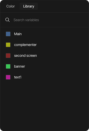
You can also manage variables directly from the Color Picker library:
-
Edit a variable: Click the Edit button next to a variable to change its name and color value. Click OK to save or X to cancel.
-
Create a new variable: In the Color tab, click the Plus (+) button, give the new variable a name, and click OK to save.
Switching Themes
After configuring your themes and assigning color variables to your elements, you can easily switch between them. This allows you to see how your UI looks with different themes in real-time, directly within the editor, making it easy to fine-tune your color choices instantly.
Bonus Tip
Did you know you can trigger a theme change with an event?
Simply add a new Event to an element (like a button) and select the Switch Theme action from the Actions list. Now you can change the entire UI's theme with a single click!
Summary
Global color variables help you modify the colors of your entire interface quickly and consistently. There's no more need to manually find and replace colors; simply update the variable's value, and the change is applied everywhere automatically.